MIS Business Data AnalysisMock Dashboard with Log-In
Nov - Dec 2021
Nov - Dec 2021
My objective for this project was to utilize Excel and VBA to explore the potential of data analysis and showcase the impact that insightful visualizations can have in a business environment. Through this project, I have gained hands-on experience in the creation of dashboards and advanced my knowledge in the field of data visualization.
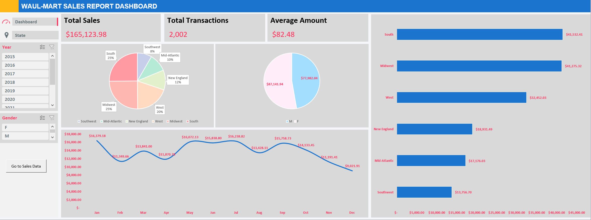
The target audience for this dashboard is the management-level staff within the sales department of a grocery chain. In this scenario, the grocery chain is assumed to be Waulmart. The management level staff needs to analyze sales data to identify patterns and trends to make informed business decisions. this requires a dashboard that provides an intuitive and quick summary of sales data collected from various stores across the US. The dashboard provides metrics such as total sales to date, number of transactions, average transaction value, as well as charts to show patterns and trends using the sales data over time.

The mock Welcome Page features two buttons, "Exit" and "Log In". By clicking on "Exit", it triggers a VBA command to close the excel workbook. If "Log In" button is clicked, a pop-up window appears, prompting the user to enter their username and password to access the sales data. The authorized username is "admin" and the password is "password1". The entered information is validated against the sole username and password combination programmed in the VBA code.

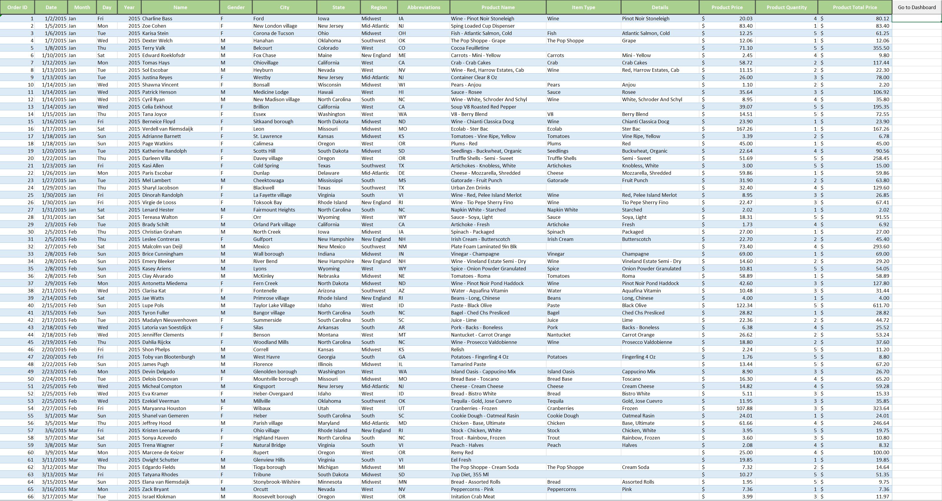
Once the correct username and password combination is entered, the user is presented with the sales data sheet which comprises of information such as OrderID, Date , Customer Name, City, and State, along with the items purchased and their corresponding quantities. On the top right corner, there is a "Go to Dashboard" button which will direct the user to the dashboard page that displays aall the tracked metrics.

The dashboard presents "real-time" insights into the sales data, including Total Sales, Total Transactions, and Average Amount. On the left-hand side, there are Year and Gender Filters, which allow the user to dynamically filter the data on the Sales Data sheet. The updated data is immediately reflected on the dashboard. Additionally, there are tabs for Dashboard and State on the left-hand side, which provide access to the Dashboard sheet and State sheet. These sheets display the Total Sales for each State based on the currently applied filters.

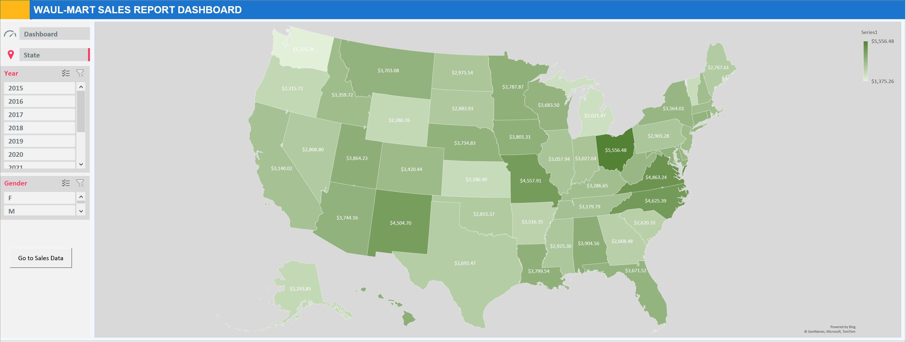
The State map presents a heatmap visualization of sales data distribution, reflecting the Year and Gender fitlers applied by the user. This representation provides a clear and intuitive illustration of the sales performance across different states ad provides insights into regional sales trends and patterns. The heatmap color encoding allows for quick and easy identification of high and low sales areas, providing a valuable tool for the user to make informed business decisions.